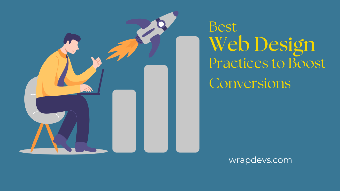
An effective website can convert browsers to do what one wants them to: sell, sign up, or take any other action that a person may want. Although many elements determine the conversion rate, design is one of those key ingredients in effectively persuading user behaviors. Whereas an intuitive, well-understood design may coax a visitor towards conversion, a clumsy or ill-thought-out web layout can drive them away from such an end. In that respect, here are some of the best web design practices that can actually help one increase their conversion rates and thereby enhance the performance of their website.
1. Simplify Navigation
a) Clear and Intuitive Menu
A too complicated or cluttered navigation tends to confuse the visitor who is trying to find his/her way around. Streamline your site’s navigation by keeping the number of menu items minimal and putting them in logical order. A clear and intuitive navigation structure helps users navigate deeper into your website and supports CTA for conversion at ease.
b) Breadcrumb Navigation
Employ the use of breadcrumb navigation to enable users to know precisely where they are on your site and be able to work their way back through previous pages with ease. This is more helpful in e-commerce websites where products are listed under various categories, thereby enhancing user experience.
2. Employ Explicit and Appealing CTAs (Call-to-Action)
a) Bold and Visible Buttons
An extremely important ingredient in improving conversions is a call-to-action (CTA). Your calls-to-action need to be highly visible and spell out what the user is to do. Using bold, contrasting colors with big buttons that click means it will be impossible not to notice the CTA.
b) Action-Oriented Language
Use action-oriented language on your CTA text. Instead of the general “Submit” and “Click Here,” try to use an exacting and captivating phrase like “Get Your Free Trial” or “Download Now.” This creates urgency and clearly defines exactly what users stand to gain by clicking on the button.
3. Leverage Visual Hierarchy
Visual hierarchy means the guiding of a design principle in order for the user’s attention to be focused on the most relevant elements of the page. By using different-sized elements, color, and placing things like headings, images, and CTAs, it will direct users to conversions.
a) Use of White Space
White space-or negative space-is important for a clean, uncluttered design that focuses a user’s attention on important elements. Giving adequate spacing around your calls-to-action, headlines, and images will allow you to attract visitors to the most vital parts of the page.
b) Strategic Use of Colors
Colors play a major role in communicating your branding while engineering user behavior in specific ways. Use contrast colors to make your calls-to-action pop, but keep the rest of your site colors harmonious in design.
4. Optimize for Mobile Devices
a) Mobile-Responsive Design
With the majority of web traffic coming from mobile devices, this is incredibly important to ensure that your website is fully responsive and that you can ensure a great user experience regardless of screen size. **Mobile responsive design** automatically adjusts layout, text, and images to best fit the user’s device for easier navigation and conversion.
b) Touch-Friendly Elements
Make buttons, forms, and other interactive elements thumb-friendly. Provide ample size to click them without any problem and keep them far enough from other elements to avoid unwanted clicks.
5. Increase Page Load Speed
a) Fast Loading Time Equals Better Conversions
Website speed affects the satisfaction of users and, consequently, your conversion rates. If your website takes much time to load, it will annoy visitors who will leave before the page even finishes loading. In fact, according to research, 53% of mobile users will abandon a site that takes longer than 3 seconds to load. Optimizing your website for speed can significantly boost your conversions.
b) Tools for Speed Optimization
Following are a few tips to help improve the load times:
– Image compression without sacrificing quality.
– Utilizing a content delivery network (CDN) can help in setting up your website content across a wide variety of different servers.
– Minimize HTTP requests by combining CSS and JavaScript into fewer files.
– Enable browser caching so resources can be stored locally on users’ devices.
6. Add Trust Signals
a) Testimonials and Reviews
Showing customer testimonials and product reviews can instill a sense of trust in your visitors. Positive feedback from previous clients or customers reassures users that they are on the right track, thus encouraging them to convert.
b) Security Badges and Certifications
For online retailers, the presence of security badges and certifications-SSL certificates, payment provider logos, or trust seals-can be especially reassuring. These badges reassure users that your website is secure, that their data will be safe, and can reduce friction and increase the likelihood of a completed transaction.
7. Simplify Forms
a) Keep Forms Short and Simple
Long, complicated forms are one of the surest ways to ensure that users abandon the process of conversion. Cut to the chase by asking for just the information that you actually need from the user. If you are only capturing an email sign-up, for example, don’t ask for an address or phone number unless you truly need it.
b) Use Multi-Step Forms
In more complex processes, such as registration and checkout, multi-step forms may reduce friction. The division of the process into smaller, more manageable pieces decreases perceived burden for users.
8. Create a Sense of Urgency
a) Limited-Time Offers
One surefire strategy for increasing conversions is generating urgency. One can employ limited-time offers, countdown timers, or even indicate low stock availability to swiftly encourage users into action. This psychological trigger taps into the fear of missing out-also known as FOMO-which nudges people toward taking immediate action.
b) Emphasize Benefits of Taking Immediate Action
Emphasize the benefit of doing so immediately, whether it’s an ‘exclusive discount,’ ‘free shipping, or ‘bonus content’. These should also be called out near your CTAs.
9. A/B Testing and Continuous Improvement
a) Test Different Designs
A/B testing allows you to match two distinct web page variants against each other, determining which design, layout, or element performs better. Testing various versions of the CTAs, headlines, button colors, and images will allow you to see which conveys the biggest conversions. Data-informed design decisions can greatly affect your website’s overall performance.
b) Iterate and Improve
The design process does not stop at launching your website. Continuously monitor your site’s performance through analytics tools and heat maps, showing how people use your site. Regularly update the design to fit user preferences and trends.
10. Employ Visuals and Videos
a) High-Quality Images
This will enhance user interaction and establish trust through the use of high-quality images relevant to your brand and message. Avoid using stock images, as they tend to appear generic. Replace them with authentic visuals that are representative of your brand.
b) Engagement Videos
Adding explainer videos or even demonstrations of products can improve conversions by giving users a better feel for what they will get. Of course, they are also highly engaging means through which to present information in a much easier-to-understand format.
Conclusion
Web design is more than just good looks; it’s about creating a seamless, engaging experience that will convert visitors into taking action. Try to implement these design habits: simplify navigation, optimize CTAs, improve page speed, and other trust signals. Make sure your website looks amazing, but also optimized for high conversion rates. Testing and iterating is very important, and that will keep your site current with user behavior and industry trends. Apply the right design strategy and unlock serious results for your business from your website.